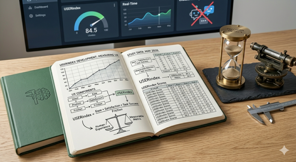
Making the User Experience Measurable
The USERindex is a standardised means of measuring the user experience of a digital interface.
“ If you can’t measure something, you can’t understand it. If you can’t understand it, you can’t control it. If you can’t control it, you can’t improve it.”
― H. James Harrington
In our usability testing projects, we have used a range of different UX metrics over the years. While all metrics have their merits, we were looking for something that is ‘quick and easy’ (think SUS), but also collects information on metrics such as appeal and satisfaction, which are more relevant today than they were when the SUS was created.
We also wanted the metric to be freely available, because we don’t believe anyone should have to pay for a robust usability measurement system, and simple to evaluate. From this need, the USERindex was born.
As of 2024, ten years after its introduction, the USERindex has been used in more than 700 studies with over 15,000 participants.

Why measure UX?
In the working environment, we measure things in order to make performance visible because we want to evaluate how well we’re doing, define targets and allocate resources for achieving those targets.
Making performance visible means it can be managed objectively in order to uphold a certain standard or improve the bottom line.
Measuring UX matters because it turns “users seem frustrated” into evidence you can act on.
What is the USERindex?
The USERindex is a standardised means of measuring the user experience of a digital interface. While usability refers to how successfully a user can carry out a task with a given product, User Experience takes a broader view, taking the user’s individual perception of his entire interaction with the product and even the brand into consideration.
Today, the success of a digital interface is determined not only by the functions it offers but also, and maybe even more importantly, by how the user feels about interacting with it.
How to use the USERindex
We developed the USERindex in 2014 because we wanted to measure the user experience of a digital interface in a repeatable, scientific manner. This enables the product owner to derive insights for improvements, monitor the evolution of the user experience over time and benchmark it against other products.
But above all, we wanted it to be based on questions that are simple to complete for study participants and result in a single score that is simple to evaluate for UX researchers.
What is the USERindex?
The USERindex is a standardised means of measuring the user experience of a digital interface.

Beyond Traditional Interfaces
We say “digital interface” because that, today, “digital” no longer refers only to desktop or web applications and mobile apps. It also includes smart devices such as wearables, as well as physical products increasingly equipped with digital interfaces, including cars, vacuum cleaners, and refrigerators. And these digital interfaces also encompass chat and voice-based interactions.
Positive Statements Approach
We researched our choice of positively expressed statements (as opposed to a mix of negative and positive statements) and deliberately decided to go with them because we don’t believe that we need to negatively word the statements in order to achieve more accurate results. This has also been proven in a study where the SUS was deployed in both its original format of both negative and positive statements as well as an entirely positively worded version and the variance was found to be negligible (SUStisfied? Little-Known System Usability Scale Facts).

Usability vs User Experience
While usability refers to how successfully a user can carry out a task with a given product, User Experience takes a broader view, taking the user’s individual perception of their entire interaction with the product and even the brand into consideration. Today, the success of a digital interface is determined not only by the functions it offers but also, and maybe even more importantly, by how the user feels about interacting with it. The subjective, more emotional factor is becoming the deciding factor. The USERindex takes this into consideration.
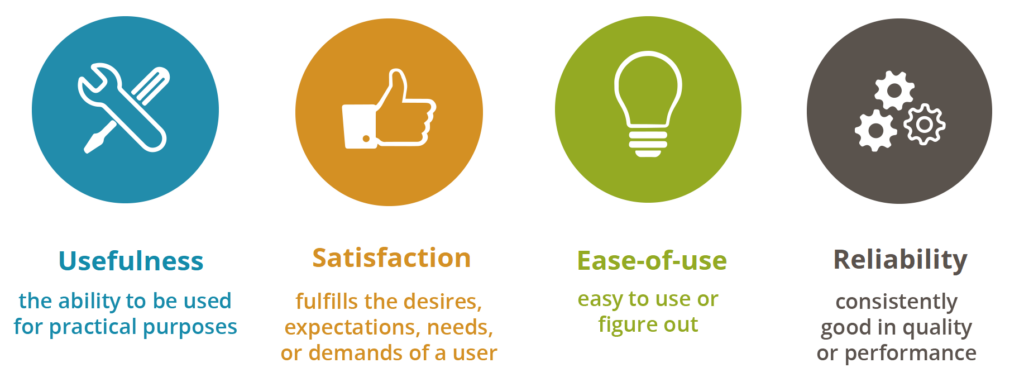
Four UX Dimensions
We believe that an exceptional user experience is determined by 4 factors (which we call USERindex dimensions):
- Usefulness
- Satisfaction
- Ease of use
- Reliability
And these 4 dimensions are correlated; thus improving one dimension will have an impact on the others.

Standardized UX Measurement
The USERindex comprises 10 questions which have been worded neutrally, avoiding jargon and which can be applied to any digital interface, be it a web application or a wearable device. This makes the index very powerful because it can be used to compare the user experience of different products even if they are very dissimilar in function and interface type.
UX Dimensions & Aspects
Each dimension is in turn defined by aspects which comprise both very objective facets of good user experience such as the accuracy of the information and the responsiveness of the interface, as well as very subjective ones such as whether the user liked using the interface.
| DIMENSION | ASPECT | STATEMENTS |
| Usefulness | Effectiveness | The site does what I need it to do |
| Usefulness | The information on the site was useful to me | |
| Satisfaction | Appeal | I found the design of the site appealing |
| Engagement | I liked using the site | |
| Ease of use | Ease of use | I found the site easy to use |
| Navigation | It was easy to find what I was looking for on the site | |
| Learnability | It didn’t take me long to learn how to use the site | |
| Efficiency | It didn’t take me long to complete my task on the site | |
| Reliability | Performance | I felt the site responded quickly |
| Accuracy | I found the information on the site to be accurate |

Why measure UX?
Today, we are constantly measuring how we perform so why wouldn’t we measure how our UX performs?
Here are 6 good reasons why you should:
1
Find friction before it costs you
Users may abandon, complain, or stop returning because of small usability issues. UX metrics reveal where people struggle.
2
Improve conversion and retention
Better UX usually means more users complete key actions: sign up, buy, subscribe, renew, book, or contact you.
3
Prioritize product decisions
Instead of debating opinions internally, teams can compare evidence: task success, satisfaction, USERindex, etc.
4
Reduce development waste
Measuring UX helps avoid building features users do not understand, need, or enjoy using.
5
Benchmark progress over time
Good UX is not a one-time check. Metrics let you see whether redesigns, new features, or fixes actually improved the experience.
6
Align teams around user outcomes
Product, design, engineering, marketing, and leadership can work from shared indicators rather than subjective preferences.
So the question actually should not be “why measure user experience?”, it should be “why aren’t you measuring the user experience of your digital interface yet?”
How to use the USERindex
Simply ask your users to rate the 10 USERindex statements on a 5 item Likert scale
The USERindex is very simple to use. Ask your users to rate the 10 USERindex statements on a 5 item Likert scale (from strongly disagree/somewhat disagree/neutral/somewhat agree/strongly agree) and then use this USERindex Calculator spreadsheet to calculate the overall USERindex as well the individual score of each dimension.
When to use the USERindex
- The USERindex can be used during formative usability tests to determine, mould and monitor the user experience during the development phase.
- After go-live, it can be used in summative usability tests to validate the expected user experience; to determine a benchmark value and monitor its improvement during the subsequent product lifecycle.
- It can also be used to compare the user experience of different digital interfaces in a competitive analysis.
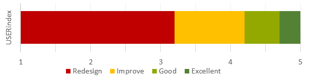
How to interpret the score
The value of USERindex ranges from 1 to 5. A digital product with an exceptional user experience will have a USERindex of 4.7 or above; anything between 4.2 and 4.7 is good and a USERindex of below 4.2 means you have uncovered areas for improvement.
If the USERindex is used in a test environment, questions about performance will not reflect realistic use by end users. To minimize the impact of non-production-like circumstances, the score calculation in the USERindex Calculator can be configured accordingly.
Some tips:
- Replace the word ‘site’ with a more meaningful term if you feel “site” does not work for your digital product. For instance, use “mobile site” for a mobile website, “app” for a native app, “watch” for connected watch, etc…
- Make the questions optional in order to avoid forcing users to evaluate an aspect they might not find applicable.
Applications
The USERindex has been used to measure inclusive experiences, conversational interface UX, and delightfulness, demonstrating its versatility and potential to support many more use cases.
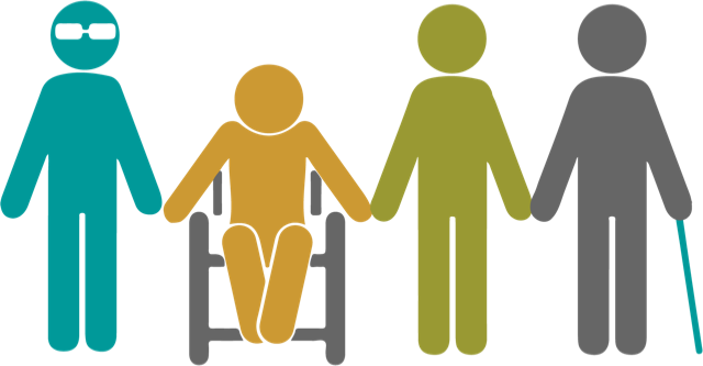
Measuring Inclusive Experiences
The USERindex is a benchmarking score created in 2014. To date, the USERindex has been used in over 700 studies across 50 countries and has been adopted by companies worldwide as their default benchmarking system.
The USER in USERindex represents 4 dimensions: Usefulness, Satisfaction, Ease of use and Reliability. Capturing these aspects of the experience has become crucial as digital technology is now more prevalent in consumers’ daily lives than ever.
One USERindex for All
The USERindex was originally developed with digital products such as websites and mobile apps in mind. Soon after, it was successfully used to measure both the digital and hardware experiences of IoT devices.
In the past few years, we have piloted the USERindex in inclusive design UX studies with participants with disabilities and people who use assistive technologies. Our conclusion is that the USERindex is suitable for capturing and measuring the experience of participants in inclusive design UX studies.
This is encouraging, since a significant portion of the world’s population has a disability of sorts; about 15 percent of the world’s population and 30 to 50 percent of older adults in the US. And let’s not forget people all over the world who break their arm or lose their glasses, resulting in a temporary disability.
Best Practices
Here are a few best practices for interpreting scores in inclusive design UX studies.
Track Disability and Assistive Tech
Benchmarks such as the USERindex rely on self-reported feedback as the user rates the statements. A person’s frame of reference can significantly influence their ratings. For example, screen reader users are accustomed to challenging user experiences. As a result, what may seem a poor experience to some is a “good” experience for screen reader users. This can skew the ratings and it is thus a good idea to track both the disability and the assistive technology used.
Define User Personas Based on Assistive Tech
The different types of disabilities (e.g. vision, cognitive, motor impairment) are broad categories that cover a number of conditions and severity of these conditions. This variety makes it challenging to define user personas based on condition. We have found that defining user personas primarily based on assistive technology works well to collect consistent data points since the experience heavily depends on the type of assistive tech used.
Learn Through Detailed Analysis
The USERindex is represented as a single score. Yet, reviewing the scores for each statement and dimension across participants can be very insightful and help identify specific areas where the digital product may be particularly lacking.
Our world needs to be inclusive; access to a benchmarking score to measure the digital experience for everyone is simply a must have.
Measuring Delightfulness
What is “delightful” UX?
Delightful UX is a user experience that literally puts a smile on your face (or an inner smile, if you’re not the type to show emotion easily  ) simply because the interaction brings you joy. Feelings matter, and creating a positive emotional reaction influences the user’s behaviour and opinion towards the digital product they are using.
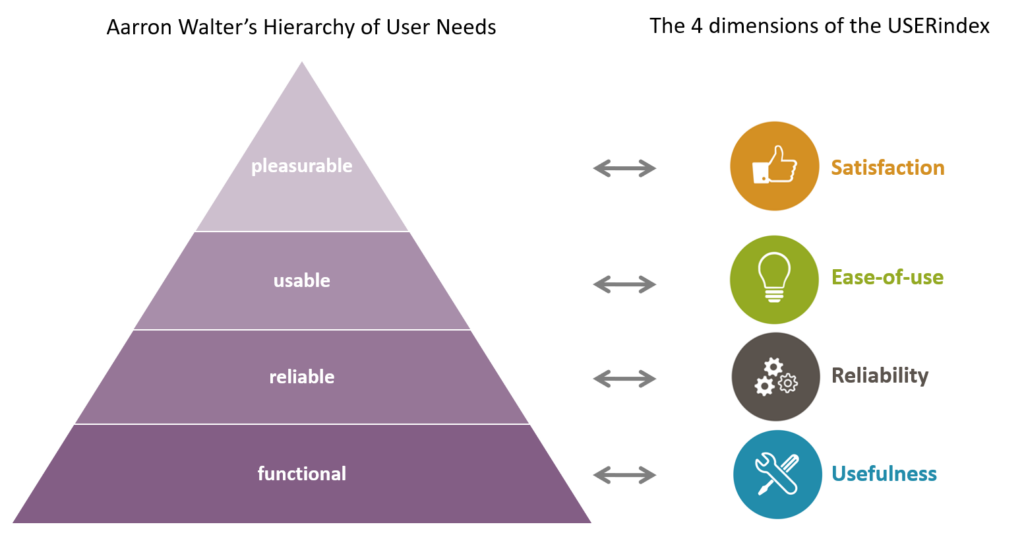
However, if the product itself falls short of the user’s needs and expectations, its delightfulness will not make up for it. This is expressed very nicely in Aaron Walter’s hierarchy of user needs, which is based on Maslow’s hierarchy of needs.
Walter remaps Maslow’s hierarchy of needs to the needs of users. He defines the most basic need a user has as functionality, followed by reliability, usability and then pleasure. Taking an app to purchase train tickets as an example: a user’s first need would be that the app does just that: allow the user to buy a train ticket (= functionality). The next need the user would have is that the app is reliable i.e. the data it provides is accurate, the payment is secure etc. and once these needs are met, the user will look for usability. Was it onerous to buy that ticket, or did the app make it seem effortless because it was so intuitive? Each of these needs is a potential exit for the user and a reorientation versus another app that might satisfy their needs better. And only once all of these needs are met, the user will appreciate if the app is pleasurable.
“Designers creating interfaces that are just usable is like a chef creating food that’s just edible.” – Aaron Walter
How do you measure delightfulness?
Nielsen differentiates between surface and deep delight; surface delight being local and contextual, while deep delight is more holistic and the one we should aim to achieve.
You can measure the surface delight simply by asking users to rate how delighted they were on a 5-point (or 7-point) labelled (or non-labelled) scale. Similarly, you could use a Likert scale and ask users to rate how strongly they felt delighted. Any of these would correctly measure the level of delight the users felt. But it wouldn’t inform you how the other aspects of the experience were perceived.
The USERindex measures a users’ subjective user experience by evaluating all 4 dimensions of their experience: Usefulness, Satisfaction, Ease of use and Reliability. These 4 dimensions map directly to Walter’s pyramid. The USERindex can thus be used to measure a product’s delightfulness as well as evaluate how the other 3 dimensions of the experience performed and identify on which level of the pyramid the product fails to live up to expectation. Try it out and do please share your thoughts!
—
Aaron Walter – Designing for emotion. http://www.abookapart.com/products/designing-for-emotion
Nielsen Norman Group – A Theory of User Delight: Why Usability Is the Foundation for Delightful Experiences https://www.nngroup.com/articles/theory-user-delight/