Broken Conversations – A Practical Guide for Improving Chatbot UX
Usability & Customization
Covers the overall user experience, including chatbot discoverability, navigation, responsiveness, visual design, and input methods. Also includes customizable settings, chat history access, and how intuitive the interface feels.
Usability and customization encompass the overall user experience, including how a chatbot is discovered, navigated, and personalized. This category covers visual design, responsiveness, and input methods, as well as intuitive interface elements like chat history and customizable settings. Beyond chatbot-specific logic, classic usability errors frequently resurface in these experiences.
When these fundamental design elements fail, the result is always the same: a frustrated user.

Scenario 1: Discoverability
A user visits a website/app to get help (e.g. track an order, understand a charge, fix a technical issue). They might be willing to use the chatbot, but cannot immediately find it, or they don’t understand its specific capabilities once it is opened.

Scenario 2: Focus and scroll behavior
A user interacts with a chatbot but is forced to manually scroll or hunt for relevant messages in the recent chat history.

Scenario 3: Chat history issues
A user chats with a support chatbot, gets useful instructions or a reference number, then navigates away to complete a step (or closes the app). Later they return and aren’t sure whether the conversation is saved. Even when history is available, finding a specific answer is difficult because the chat is shown as one long scroll with no structure.
Scenario 4: Adaptability & Customisation
A user is chatting with a support chatbot and the experience feels rigid and does not accommodate different ways users interact with chat interfaces.
Scenario 5: Visual display
A user opens a chatbot on a website to get help but the chatbot interface blocks content, hides actions, or constrains readability.
Scenario 6: Self-descriptiveness
A user chats with a support chatbot about an issue but the interface provides little feedback about the state of the conversation.
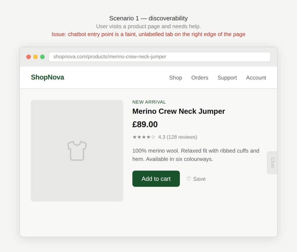
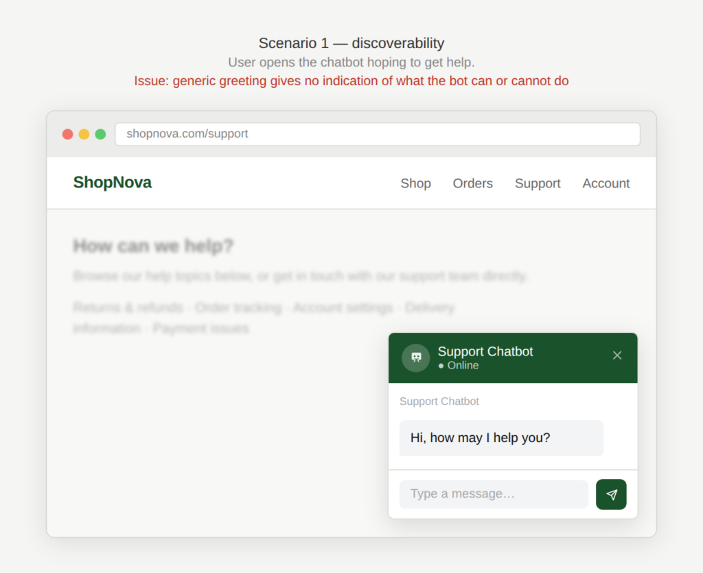
Scenario 1: Discoverability
A user visits a website/app to get help (e.g. track an order, understand a charge, fix a technical issue). They might be willing to use the chatbot, but cannot immediately find it, or they don’t understand its specific capabilities once it is opened.

Examples
Is there a chatbot?
The user does not see a chatbot icon on their page because the chatbot is buried as an option on the support page.
Can I get help?
The user does not notice the chatbot button because it is displayed very subtly at the right side of the screen
What can you help me with?
The user opens the chatbot and the chatbot responds with: “Hi, how may I help you” but gives no indication of what it can help with.
Why is this an issue?
The chatbot is hard to find and/or its scope is unclear:
- Entry point is hidden (icon not visible, buried in menus, unclear label).
- The chatbot opens without explaining what it can do for the user.
- The user doesn’t know the chatbot’s limitations (e.g. cannot access account-specific data, cannot cancel orders, cannot escalate).
- The user wastes time asking unsupported questions and gets generic failure responses.
Why do we care?
If the user can’t find the chatbot, or doesn’t understand its purpose, it won’t be used effectively. Poor discoverability reduces adoption and undermines the chatbot’s value:
- Inefficiency: Clear scope reduces trial-and-error and dead ends.
- Erosion of trust: The user may feel the experience is not predictable and honest.
- Frustration: The user repeatedly asks for things the chatbot can’t do.
- Low adoption: If the user can’t locate the chatbot, it doesn’t help reduce support load or improve the customer experience.
What is the remedy?
Users should quickly understand whether the chatbot is relevant to their task:
- Make the entry point obvious and consistent: Use a persistent “Help” / “Chat” button in a predictable location such as the bottom right corner of the web page.
- Use clear labels, not just an icon: Example: “Chat with support” instead of only a speech bubble.
- Use contextual triggers: Surface chat more prominently on support-heavy pages (checkout errors, account issues).
- Set expectations on first open: Short intro: “I can help you track orders, reset passwords, or check billing details. I can’t help with A, B.”
- Explain limitations early (but lightly): Avoid long disclaimers but state the key constraints to prevent disappointment.
- Provide suggested actions: Example buttons: “Track my order”, “Reset password”, “Talk to an agent”.
- Progressive guidance: If user asks unsupported questions, respond with: “I can’t do that, but I can do these related things…”
- Offer escalation path when out of scope: Link to agent, ticket creation, or the correct channel when the chatbot can’t help.
Are there any exceptions to this rule?
We have not come across any valid, acceptable exceptions.

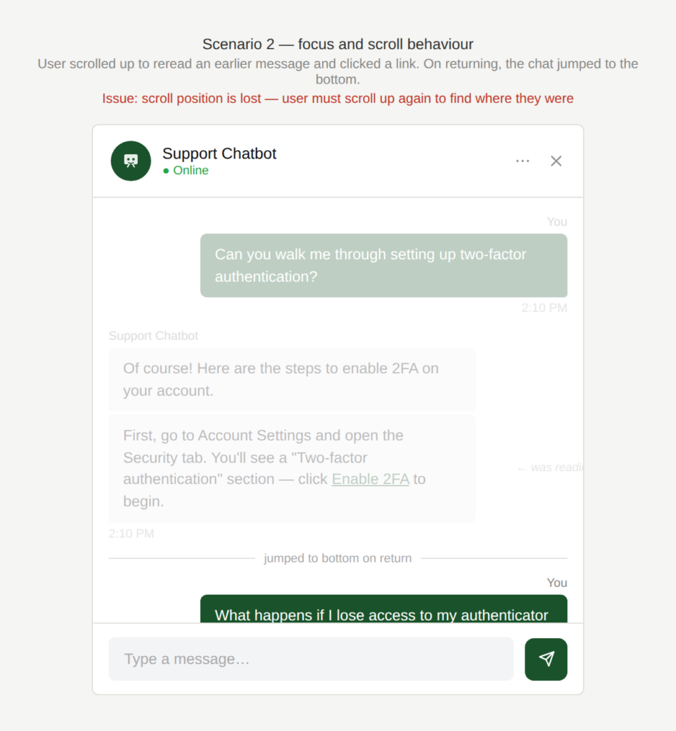
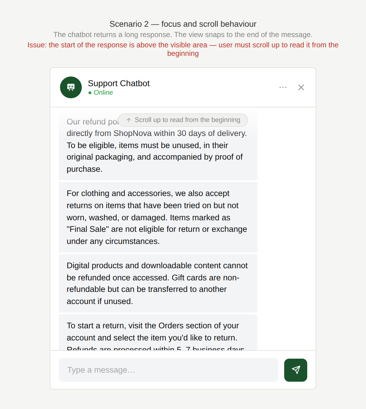
Scenario 2: Focus and scroll behavior
A user interacts with a chatbot but is forced to manually scroll or hunt for relevant messages in the recent chat history.
Examples
Where was I?
A user scrolls up in the chat to reread an earlier message and then clicks on a link from the chat and then returns. The chat automatically jumps to the bottom, so the user loses their place and must scroll again.
Where does your answer start?
The chatbot sends a long response and the view lands at the bottom of the message, forcing the user to scroll up to start reading the beginning of the response.
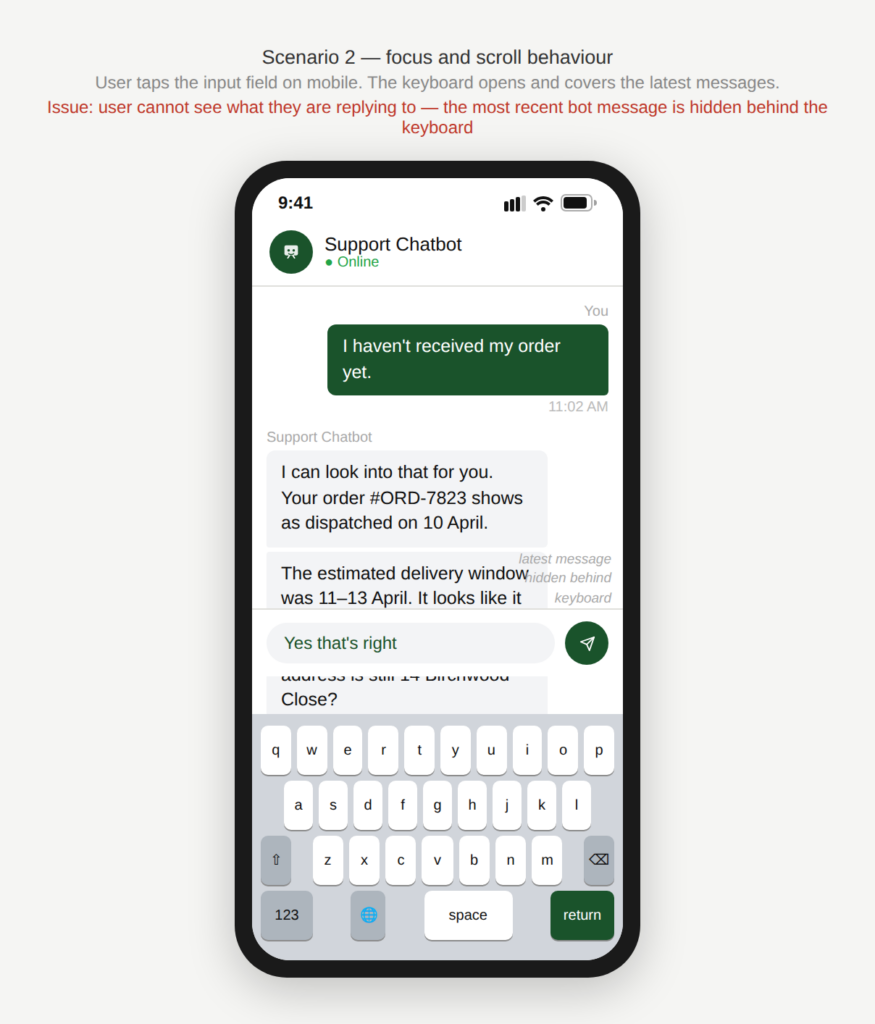
How can I see what I am typing?
On mobile, when the keyboard opens, it covers the latest messages and input area, making it hard to see what the user is replying to.
Why is this an issue?
The chatbot does not handle focus and scroll behavior well:
- Auto-scroll forces the user to the bottom even when they intentionally scrolled up.
- Returning from a link resets the scroll position (“lost place”).
- Long responses open at the end of the message rather than the beginning.
- Mobile keyboard covers the latest content, reducing visibility while typing.
Why do we care?
We need to avoid unnecessary scrolling and disorientation:
- Loss of last position: Users lose context and waste time relocating the relevant part of the conversation.
- Reduced readability: Long answers become harder to consume.
- Error risk: Users may respond incorrectly because they can’t see the latest message while typing.
- Frustration: This is a high-frequency micro-annoyance that makes the whole chatbot feel clunky.
- Perceived instability: Jumping interfaces feel clunky and poorly designed.
What is the remedy?
Focus management should support the user’s reading and interaction behavior, not override it:
- Respect user scroll intent: Only auto-scroll if the user is already near the bottom. If they scrolled up, keep the position stable.
- Provide a “New messages” indicator + jump button: Show “1 new message” with a “Jump to latest” button instead of forcing scroll.
- Preserve scroll position when returning: Maintain the user’s place in the conversation after opening links or switching screens.
- Handle long smartly: Anchor to the start of the new chatbot message, or collapse it with “Read more” so it doesn’t push focus.
- Offer a mobile keyboard-safe layout: Ensure the input and last message stay visible when the keyboard opens at the bottom of the screen.
Are there any exceptions to this rule?
There are justified exceptions when setting the focus to might be acceptable, such as:
- First-time opening of the chatbot: Defaulting to the latest message on initial open is typically expected.
Scenario 3: Chat history issues
A user chats with a support chatbot, gets useful instructions or a reference number, then navigates away to complete a step (or closes the app). Later they return and aren’t sure whether the conversation is saved. Even when history is available, finding a specific answer is difficult because the chat is shown as one long scroll with no structure.
Examples
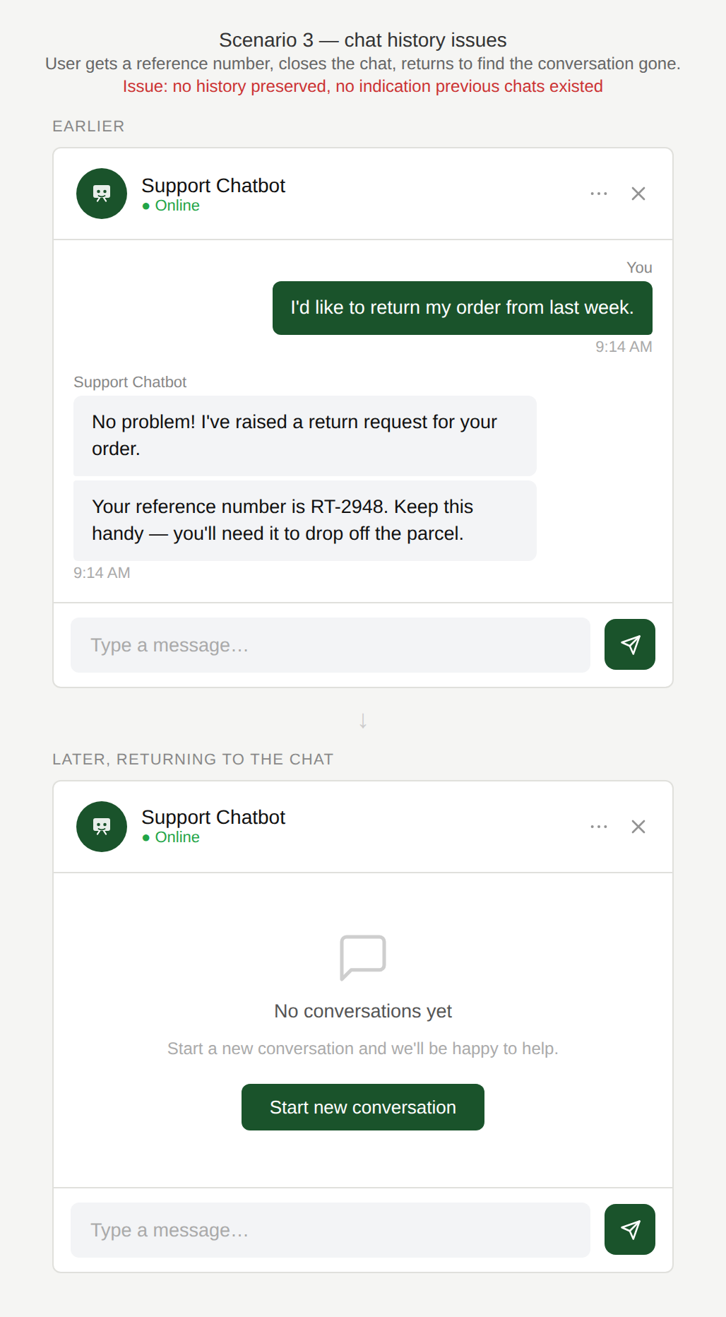
Where is my history?
The user receives a support reference number during a chat, closes the window, and returns later to find the conversation gone and a blank “Start a new conversation” screen with no indication that previous chats exist.
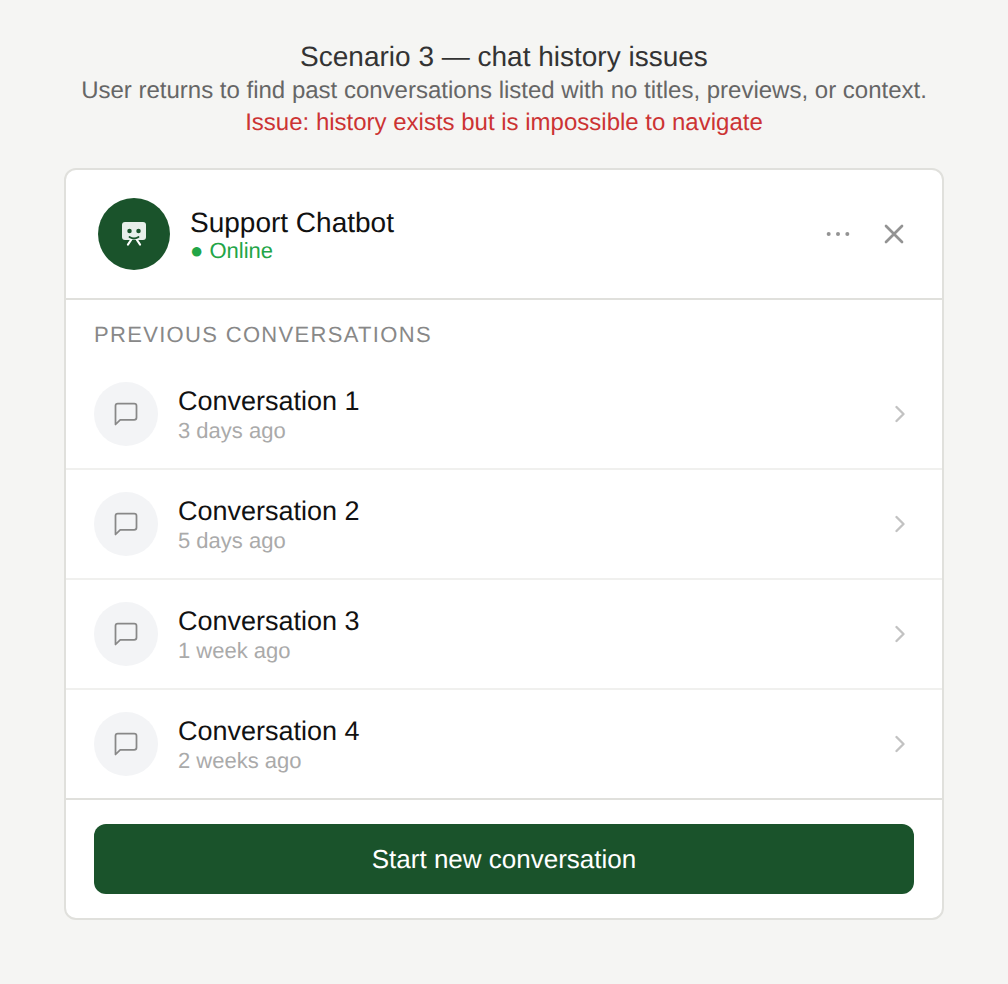
How do I find the right conversation?
The user returns to find multiple past conversations listed with no titles, timestamps, or previews, only “Conversation 1”, “Conversation 2”, making it impossible to know which one contains the information they need.
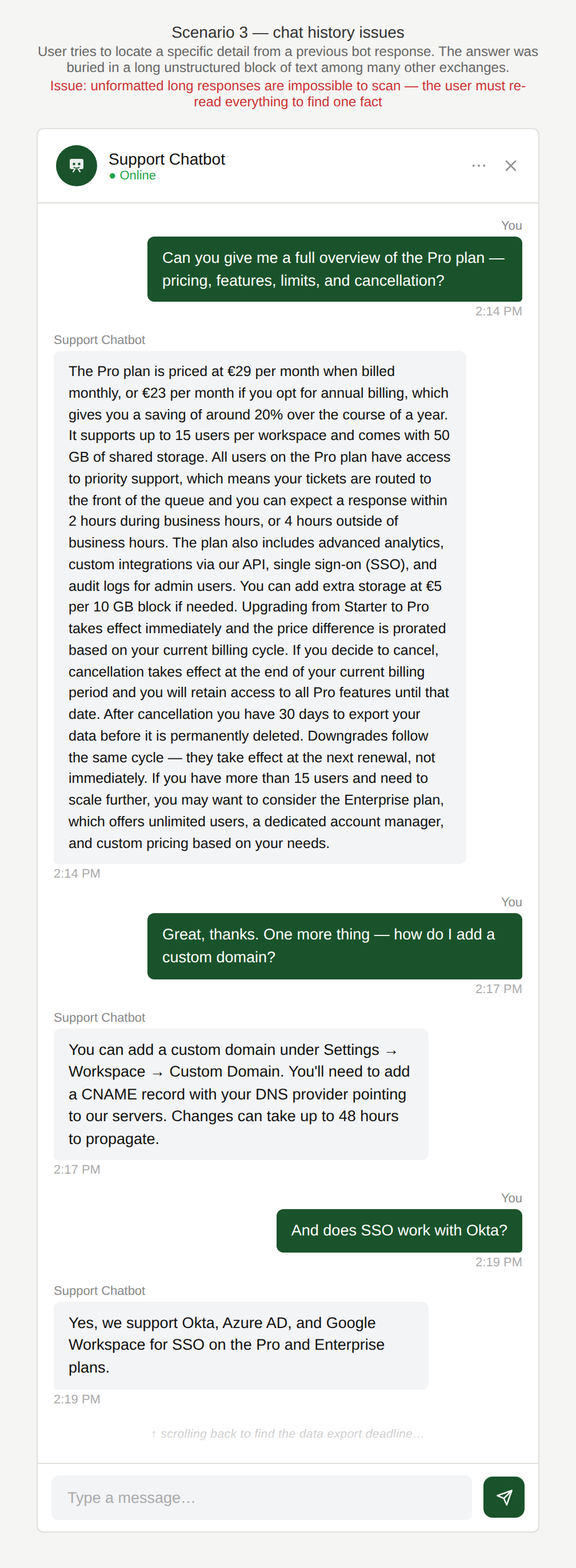
Where is it?
The user scrolls through their history but the information is presented as a single unstructured scroll and it is very difficult for the user to find the piece of information they are looking for.
Why is this an issue?
Chat history is unclear and difficult to use:
- The user doesn’t know if the conversation will be saved or lost.
- History may disappear after navigation, refresh, logout, or session timeout.
- Even when saved, it’s hard to retrieve key info (IDs, links, instructions) from a long thread.
- No way to search, filter, bookmark, or summarise important parts.
Why do we care?
Chat persistence and easy retrieval of the chat history are essential for effective self-service:
- Lack of continuity: Users often need to leave the chat to perform steps and return without losing context.
- Inefficiency: The user wastes time scrolling to find critical details (ticket numbers, steps, links).
- Erosion of trust: Losing history feels unreliable and increases support re-contact.
- Task failure: If the user can’t retrieve the information they are looking for efficiently, they may abandon the task.
What is the remedy?
Chat history should support real-world task flow and be easily accessed:
- Be explicit about persistence: Show a clear message like: “This chat will be saved for 30 days” and state where it can be accessed (or “This chat won’t be saved”).
- Provide a “Chat history” entry point: Offer a list of past conversations with date + topic preview.
- Add search and key highlights: Allow searching within a conversation and highlight important items (links, codes, order IDs).
- Offer conversation summaries: Provide a short summary with actionable steps and referenced numbers.
- Allow saving/exporting: Provide options to persist history such as: “Copy summary”, “Email transcript”, or “Save to notes”.
- Use structured message types: (see also Content and Accuracy) Render instructions, steps, and IDs in visually distinct blocks instead of plain text.
Are there any exceptions to this rule?
There are justified exceptions when persisting the chat history might not be desired, such as:
- Privacy-first / sensitive topics: For payroll, medical, or personal data, it may be appropriate not to persist history (but it must be clearly communicated).
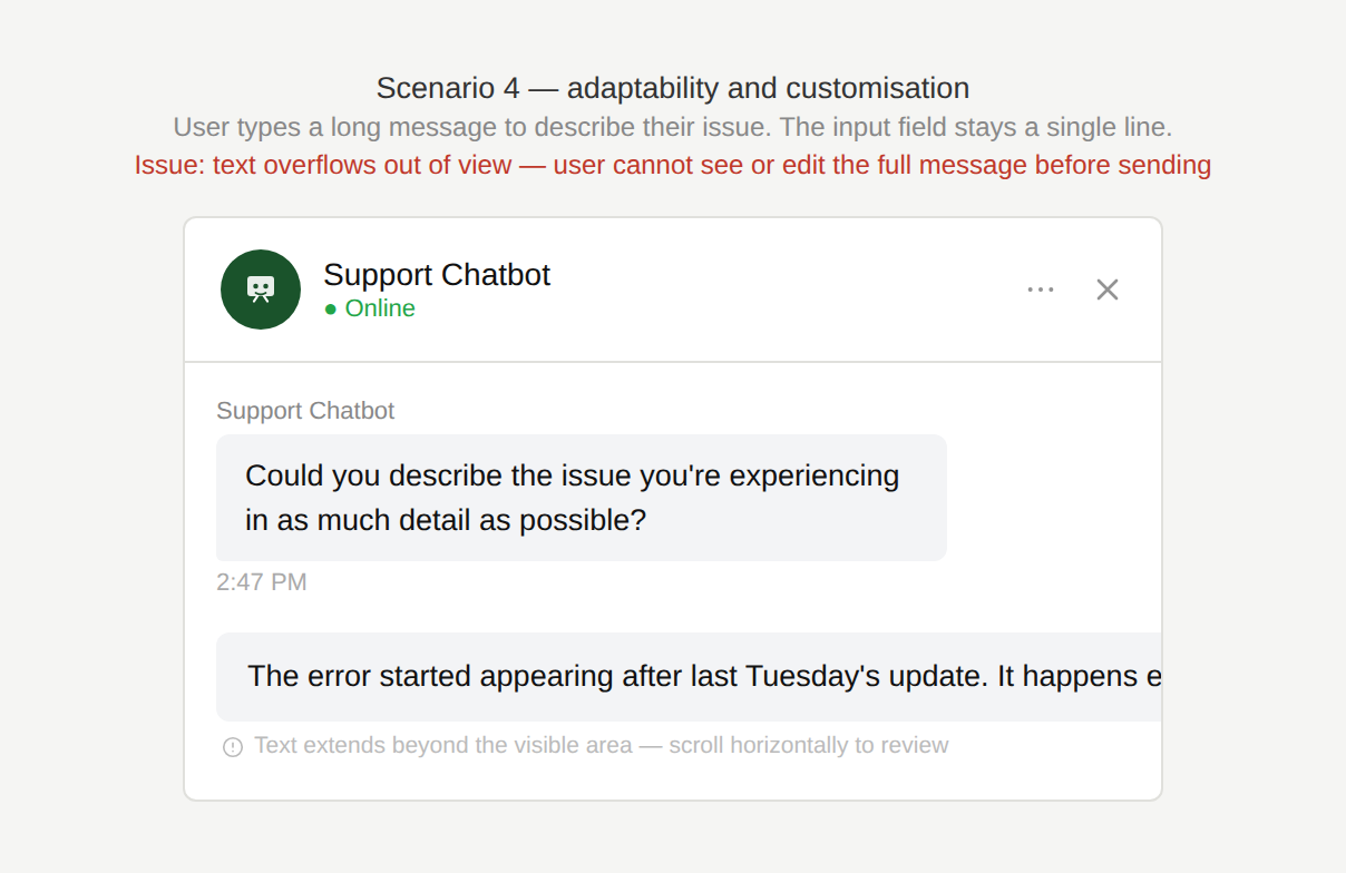
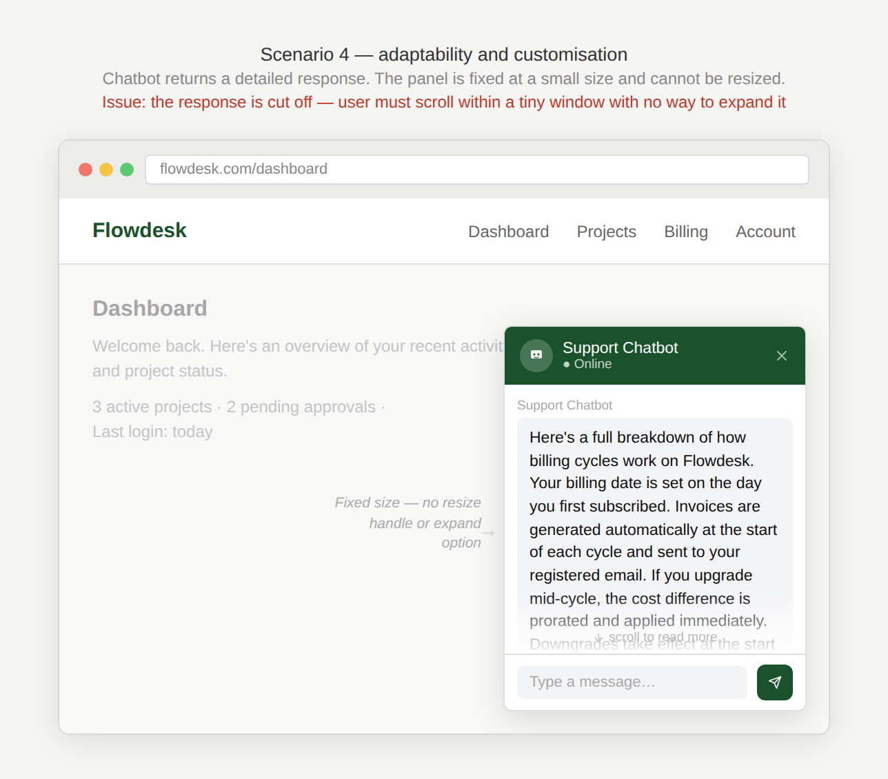
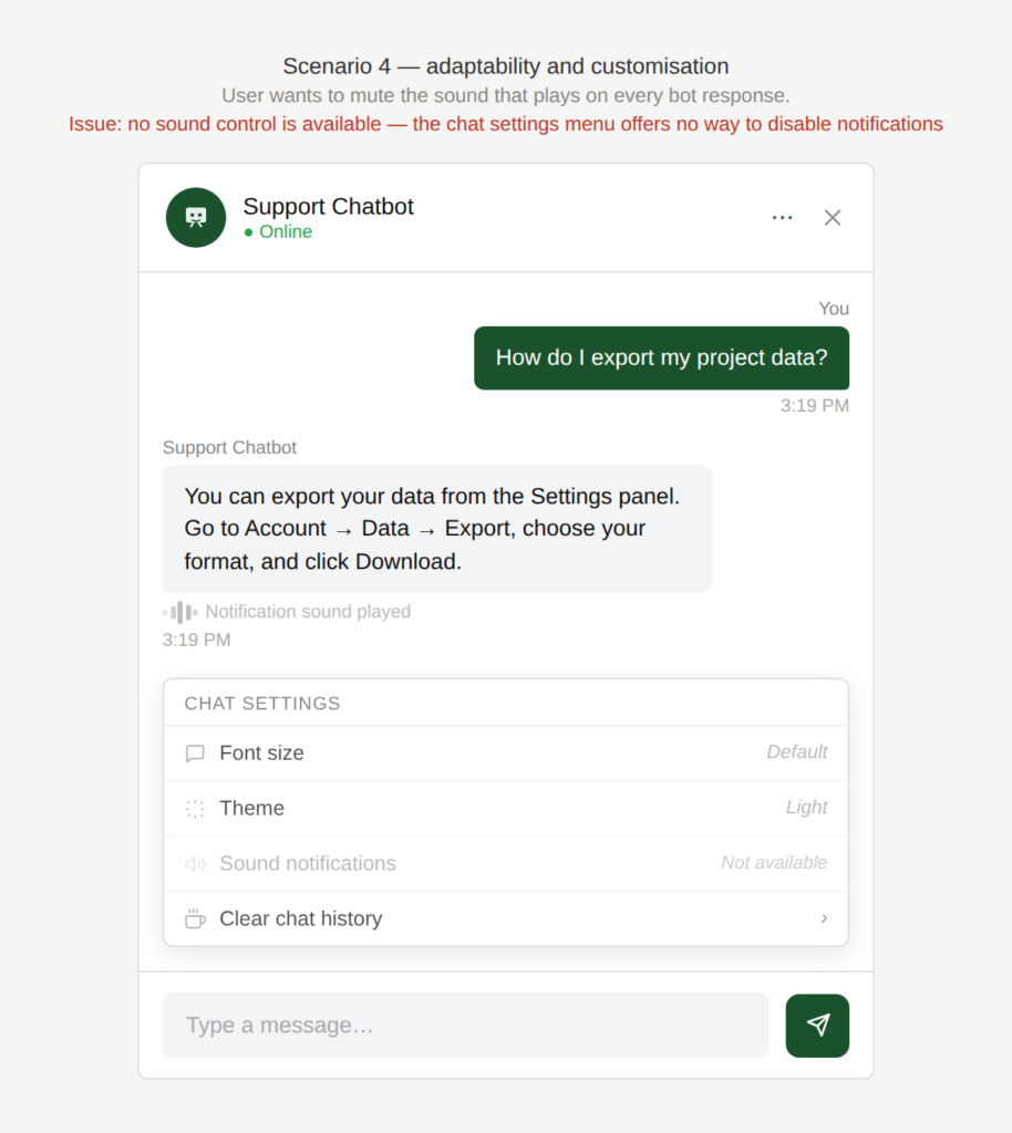
Scenario 4: Adaptability and Customisation
A user is chatting with a support chatbot and the experience feels rigid and does not accommodate different ways users interact with chat interfaces.
Examples
Do I have to fit my question
into this small field?
The user needs to type a longer message to explain their problem, provide additional details, or paste an error code. The message field remains a single line and does not expand, making it difficult to review or edit the text.
Why can’t I make the window larger?
The chat window cannot be resized, making long responses or previous messages hard to read.
How can I turn off this sound?
The user also has no control whether a sound is played each time the chatbot responds.
How can I make the field visible?
On a mobile phone, the keyboard covers the bottom half of the screen and the last chat messages as well as the input field are not visible.
Why is this an issue?
The chatbot interface does not adapt to common user behaviors and preferences:
- The input field doesn’t expand to accommodate longer messages, making editing painful.
- The chat window can’t be resized, limiting readability of long answers or history.
- There are no controls for basic user preferences (formal/informal address, sound on/off, reduced motion, etc.).
- Input focus is not consistently returned to the text field after each step.
Why do we care?
The experience is “one-size-fits-all” and can feel outdated or frustrating and reduces the overall usability:
- Inefficiency: Users waste time scrolling within a tiny input field and make more typing errors.
- Readability: Fixed chat windows make it harder to review long responses or conversation history.
- Accessibility: Fixed layouts and forced sounds can be distracting or unusable for some users.
- User comfort: Without preference settings, the interface cannot adapt to different user needs or contexts.
- Perceived quality: Rigid interfaces feel outdated and less polished compared to modern messaging tools.
What is the remedy?
The chat interface should adapt to the user, not require the user to adapt to the interface:
- Provide an auto-expanding input field: Allow the text field to grow vertically up to a reasonable limit before scrolling internally.
- Make the chat window resizable / expandable: Provide options to resize, maximize, or switch to full-screen view.
- Offer lightweight preference controls: Allow the user to adjust settings like: sound on/off, formal vs informal address, reduced animations etc.
- Implement proper focus management: Automatically return the cursor focus to the input field after chatbot responses or interactions.
- Handle long texts smartly: Offer collapsible long responses (“Show more”), copy button, and formatting for codes/lists.
Are there any exceptions to this rule?
There are justified exceptions when a more flexible approach might not be necessary, such as:
- Very short, guided interactions: If users only select quick-reply options and rarely type messages, a fixed input field may be sufficient.
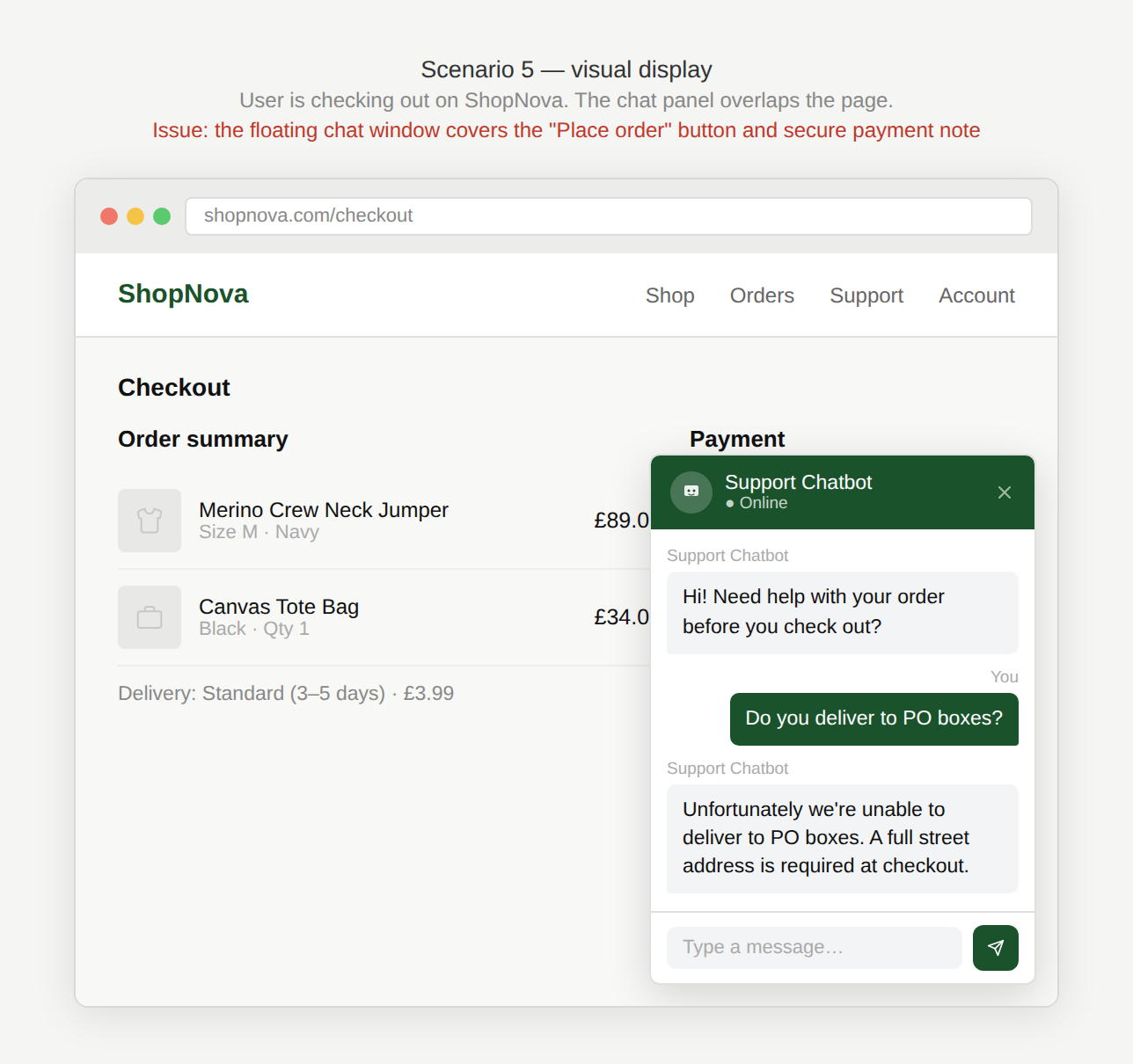
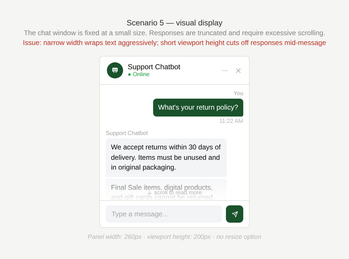
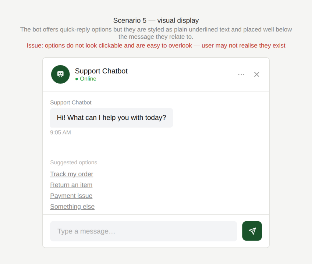
Scenario 5: Visual display
A user opens a chatbot on a website to get help but the chatbot interface blocks content, hides actions, or constrains readability.
Examples
Why is the chat covering that?
The chatbot appears as a floating window that partially covers the page underneath it. As the user tries to read both the webpage and the chatbot response, important elements on the page are hidden behind the chat window.
Why is the chat window so small?
The chat window is small and text becomes truncated or requires excessive scrolling.
Should I click on one of those?
Quick-reply options are easy to miss because they do not visually resemble clickable buttons or are displayed far from the message they relate to.
Why is this an issue?
The chatbot’s visual layout does not align with how users actually use it:
- A floating chat window blocks key website content.
- The chat window is too small which leads to content truncation and poor readability.
- Quick replies are not visually recognizable as buttons.
- Quick replies are not positioned near the message they answer, causing confusion.
Why do we care?
The interface does not effectively support simultaneous use of the page and the chatbot:
- Task completion: Users often need to reference the page and follow the chat at the same time. Blocking content slows them down.
- Readability: Truncated or cramped responses increase errors and re-reading.
- Interaction clarity: If quick replies don’t look clickable, users may miss them and get stuck.
- Perceived quality: Layout issues make the experience feel unpolished and frustrating.
What is the remedy?
A chatbot should complement the user’s task on the page, not compete with it for space:
- Offer flexible display modes: Allow users to resize, reposition, or expand the chatbot (e.g. side panel or full-screen mode).
- Avoid covering key content: Smart positioning (move away from active UI areas) or allow drag/reposition.
- Improve readability of long responses: Increase default window size, support expandable messages, or allow full-screen viewing.
- Make quick replies look like real buttons: Use clear button styling, consistent placement, and adequate contrast.
- Keep quick replies attached to the relevant message: Place them directly under the chatbot question they respond to (or not far below).
Are there any exceptions to this rule?
There are justified exceptions when a more rigid approach might be acceptable, such as:
- Mobile interfaces with limited screen space: Floating overlays may be unavoidable, though full-screen chat and clear scrolling should still be supported.
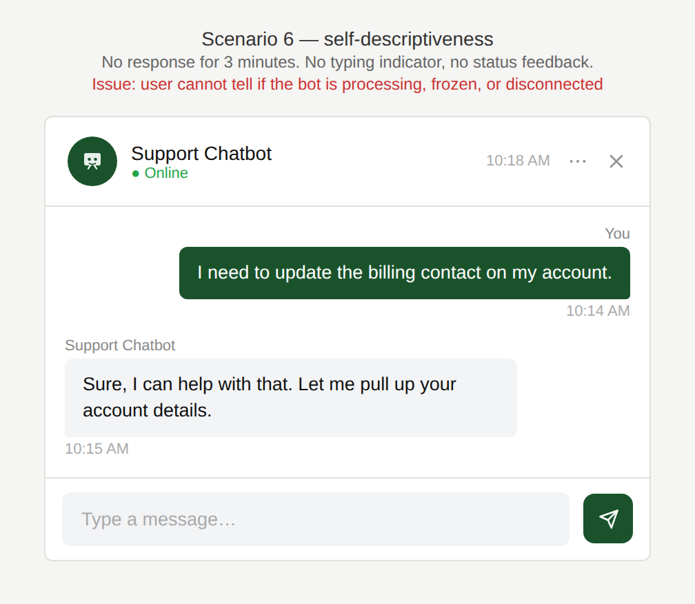
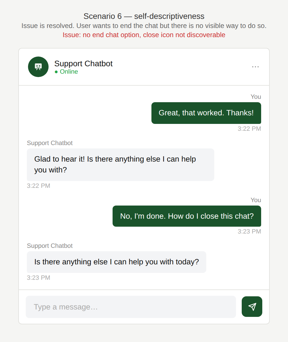
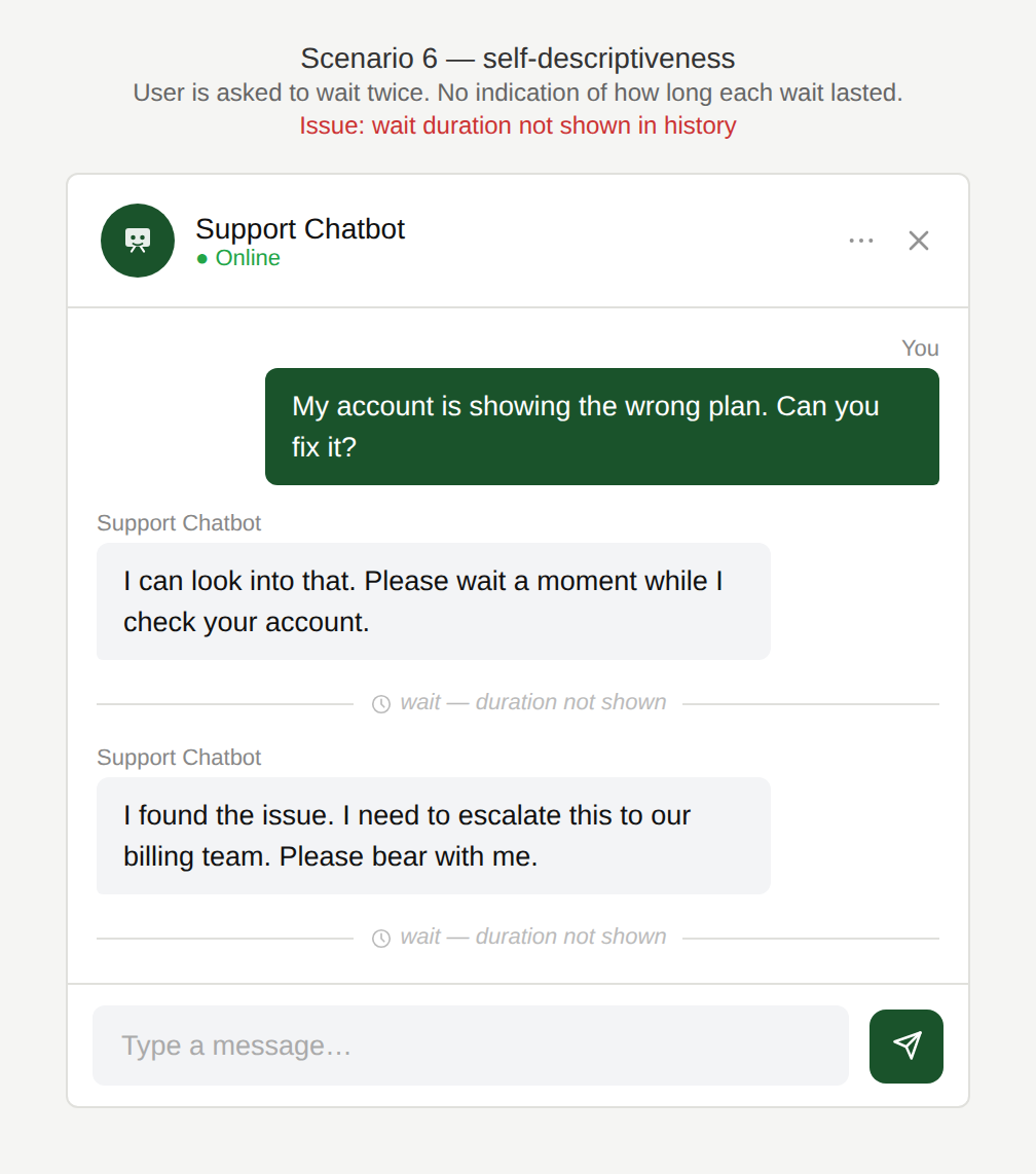
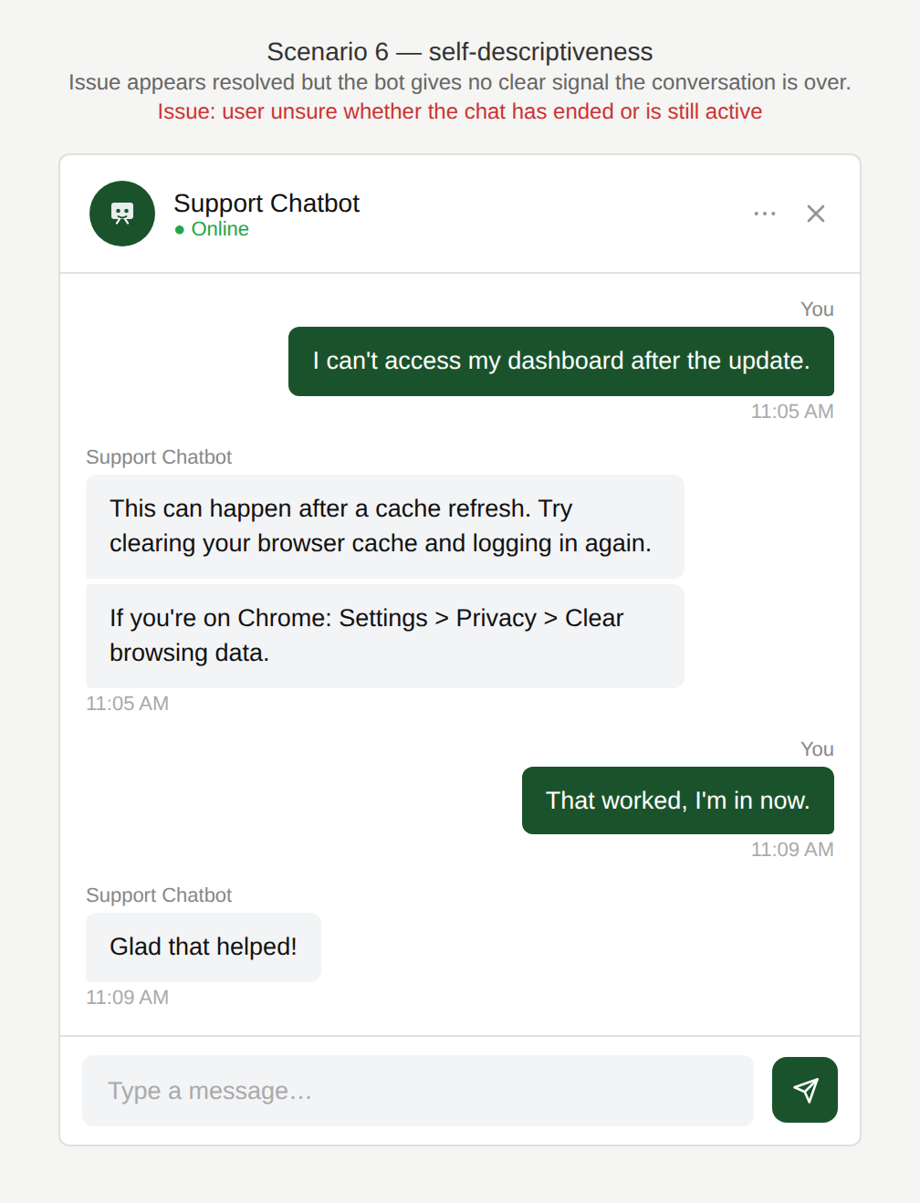
Scenario 6: Self-descriptiveness
A user chats with a support chatbot about an issue but the interface provides little feedback about the state of the conversation.
Examples
Are you still doing something?
The user is waiting for a response and is unsure whether the chatbot is still processing, albeit slowly, or whether it might have crashed or disconnected.
How do I tell you I’m done?
The user wants to end the chat but does not know how to.
How long will this go on for?
The user is asked to wait a couple of times during the resolution but the duration of the wait is not visible in the history.
Can I ask another question?
The user does not know whether the chat has ended and wants to add another message.
Why is this an issue?
The chatbot interface lacks basic self-descriptive cues, making it difficult for users to understand the status of the interaction:
- No timestamps, making it hard to track when messages were sent.
- Ending the chat is unclear (no visible “End chat” or confirmation).
- No clear “chat ended” state makes the user unsure if messages will still be received.
- Slow responses without progress feedback and the user doesn’t know whether to wait or retry.
Why do we care?
An easy-to-use chatbot leaves no questions open regarding the system state:
- Reduced confusion: Users shouldn’t have to guess system state or available actions.
- Trust & reliability: Lack of feedback makes the chatbot feel broken or unstable.
- Inefficiency: Users may resend messages, abandon the conversation, or open duplicate support requests.
- Conversation management: Timestamps and clear end states help users keep track of interactions, especially during longer sessions.
What is the remedy?
The chatbot should communicate its state clearly so users do not have to infer it:
- Add timestamps (or time grouping): Display the time each message was sent or group messages by time “Today 14:32”.
- Offer an obvious “End chat” option: Provide a clear control and show a final state: “Chat ended. Start a new chat?”
- Display clear system status indicators: Show “Bot is typing…”, “Connecting you to an agent…”, “Searching your account…”.
- Give slow-performance feedback: If a response takes time, indicate that the system is working and provide an estimated wait time where possible: “This may take up to 30 seconds.” Offer the user to be notified when the response is ready and allow them to focus on other things in the meantime.
- Display a clear post-chat state: After a conversation ends, show confirmation and provide options such as “Start a new chat”.
Are there any exceptions to this rule?
There are justified exceptions when system state displays might not necessary, such as:
- Very short interactions: For one-question FAQ interactions, timestamps and explicit end states may be less critical.